My First Xamarin app
A few days ago, my daughter was in a real funk. It breaks my heart to see her struggle. Fortunately, I knew exactly what to do, “build a mobile app!”
Before the humorless among you think I’m a callous parent, that’s not exactly what I did of course. I gave her money.
I kid. What I really did was listen to her struggles and offered unconditional love, support, and comfort. Then I went and wrote a mobile app.
The App
The idea for the app is simple. The main screen has a list of moods. She clicks on the mood corresponding to how she feels at the moment, and the app displays an encouraging message with a corresponding funny or cute image.
This might sound familiar to some of you. The idea was inspired by the Encourage for Visual Studio and Encourage for Atom plug-ins I wrote in the past.
Let’s take a look at it! This is the main screen with a list of moods.

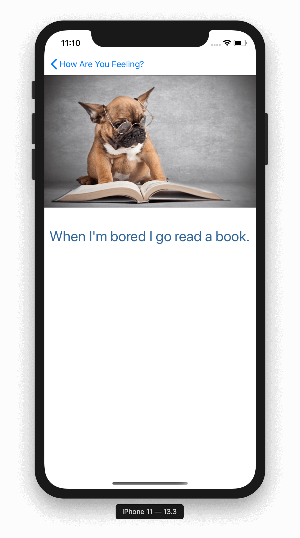
Suppose she clicks “Bored”, she’ll get a random encouragement which consists of a funny photo and a message.

For now, the image is stored as a URL and is loaded off the internet, so a connection is required to see the image. Also, all of this is configurable through a janky UI.

So if you wanted to add a mood such as “Missing my Ex” and add encouragements such as “Put down that phone!”, you could totally do that!
Choice of Stack
For most of my career, I’ve been a web slinger knee deep in HTML, CSS, JavaScript, and all the agglutinations of Active Server Pages. There was one brief interlude where I impersonated a WPF developer, but most of my career has been web tech.
Since I want to build a cross-platform app, React Native might seem a logical choice. But in the end, I wanted to build it fast and my command of XAML and C# is better than my command of React. Also, this is just an exploration for me. I am not building this with expectations of becoming an App Store millionaire. I just wanted to get it working quick and on my daughter’s phone.
The Experience
The good news is the time it took from code to something usable on the phone was very short. The longest part of it was getting all the tools installed. Since I’m on a mac, used Visual Studio for Mac as many of the tutorials assume it. For asp.net core, I’ve been using Jetbrains Rider.
You might wonder why I don’t use Visual Studio Code. Don’t get me wrong, I love VS Code. But for me, it’s like the hostel of editors. It’s vibrant and fun and perfect for me when I was younger, but as I’ve gotten older, I’ve grown accustomed to all the amenities of a proper hotel (IDE). I still use VS Code for a lot though.
Here are a few of the tutorials I followed.
- Create a Single Page Xamarin.Forms Application
- Perform Navigation in a Multi-Page Xamarin.Forms Application
- Store Data in a Local SQLite.NET Database
- Style a Cross-Platform Xamarin.Forms Application
- Xamarin.Forms Quickstart Deep Dive
Most of what I implemented is pretty boilerplate. However, one feature was a bit tricky. In order to edit a mood, I wanted the user to press and hold the button. The long press gesture doesn’t come included with Xamarin Forms. Fortunatley I found a blog post by Alex Dunn where he implements a long press effect with a custom RoutingEffect.
Some observations
- I’ve written a ton of XAML and it’s still confusing at times. It’s got quite a learning curve. Some things that should be simple are way more complicated than you’d expect. Microsoft recently announced some experimental Blazor bindings for Xamarin Forms. I might try and port my app to it for a side-by-side comparison.
- Visual Studio on Mac is beautiful, but pretty rough around the edges. Every now and then it just shits itself and decides it’s had enough of Intellisense. A restart usually brings it back. This happens with Rider too.
- Also, I don’t like that to do multi-cursor selection, I have to use the mouse or trackpad. There doesn’t seem to be block selection fully with keyboard like there is in Visual Studio on Windows.
- Every now and then it can’t match up xaml files with their code behind. It just gets in a mood I tell ya.
- It’s not clear to me how to build idiomatic data entry pages (such as setting pages) with Xamarin. I wish there was more guidance about building idiomatic apps and common scenarios.
- Despite these complaints, the overall experience of writing the app with C# 8 was a real pleasure. I started off as simple and minimal as I could. For example, I didn’t add any view models until I really started to need them. And even then, I am not using any view model frameworks. As the code gets more complicated, I may introduce something.
- Hot reload with Xamarin is so hot!
Try it out, provide feedback, or get involved
The code is up on GitHub at https://github.com/haacked/encourage-mobile.
As this is my first mobile app with Xamarin, I would love feedback and help. Especially around these areas:
- Is my approach idiomatic? Are there things I should be doing better?
- Can you help me make it look less like ass and more like awesome?
- What polish should I add?
- I need an icon.
Conclusion
I should mention before I end this post, my daughter loved the bespoke app lovingly crafted just for her. She got a good laugh out of it, then went right back to her Youtube videos never to launch it again.
Comments
3 responses