Simple Usability
Recently, I tried to accomplish a simple task on a website which frustrated me because what should have been simple, was not. All I wanted to do was go to the Mix website and quickly find links to my sessions so I could post them here. Even I should be able to figure this out.
As a note, I’m using the Mix site as my illustration here, but I do it out of love and not mean spiritedness. Mix is my favorite conference, but its website…leaves something to be desired.
It seems particularly interesting that I’d run into this with the Mix site because the whole conference caters to a web design audience as well as web development. It just goes to show that even the best designers sometimes lose sight of what makes a user interface usable in the pursuit of cool flashy design. After all, designers often are trying to impress their designer friends when they should be creating a site that allows its audience to accomplish something?
Let’s take a look at my experience. Here’s the front page. Where do I start?

Notice that there’s no search feature (I already tried Google). Fine, so I click all sessions and get this timeline view. There’s a search button there but when I type “MVC” and hit GO, nothing happens. I also try my last name. No go.
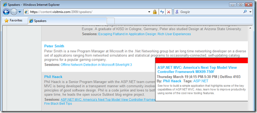
 Near the bottom, I click on SPEAKERS and find my name. I then try
clicking on one of my sessions which is highlighted as a link, and
nothing happens (it’s since been fixed). When I highlight the session, a
pop-up which appears to have links shows up, but I can’t seem to move my
mouse over it because it disappears before my mouse gets there.

After a moment of pondering, it occurs to me that maybe the video of my talk was not yet available at the time (it is now as I write this). It would have been nice if the site clearly indicated this, but instead, they were providing a link that went nowhere, giving me the impression that the video was available. Very confusing!
Now contrast that to this great post by Greg Duncan.
![Mix 09 Quick Video Link List - Gregs Cool [Insert Clever Name] of the Day - Windows Internet Explorer Mix 09 Quick Video Link List - Gregs Cool [Insert Clever Name] of the
Day - Windows Internet
Explorer](https://haacked.com/assets/images/haacked_com/WindowsLiveWriter/SimpleUsability_B713/Gregs.png)
Notice that it’s the height of simplicity. It’s a list of all sessions (after all, the list of sessions wasn’t all that long) with headings showing you which video format the session is available in. I would have loved to see something like this on the Mix site.
A quick F3 to bring up my browser’s search feature, type in MVC, and boom goes the dynamite, I’ve found my sessions and am happily dissecting my speaking performance in disgust.
Kudos to Greg for putting this together. The fact that he even needed to put this together is a major indication that there’s a problem over at the Mix site.
The problem here is that in the pursuit of cool design, designers sometimes confuse ornamentation with good design. The Mix site has all sorts of flashy elements showing off a mastery of jQuery. Whoopee! And typically, I love those elements because when done well, they can make a site more usable. But in this case, I much prefer Greg’s simpler approach.
There’s not that much data to display, so rather than chop it up into pages, he just puts it all in one page which allows me, the reader, to make use of the familiar tools built into my browser such as F3 to search. Bam! Done! I can move on now.
Keep that in mind next time as you put together your next great user interface. How can you make it simpler and leverage the tools already in the client?
Comments
23 responses