
Prose Is Dead. Long Live Prose
Charlez Petzold makes the following lament in response to Jeff Atwood’s review of two WPF books, one being Petzold’s.
I’ve been mulling over Coding Horror’s analysis of two WPF books, not really thrilled about it, of course. The gist of it is that modern programming books should have color, bullet points, boxes, color, snippets, pictures, color, scannability, and color.
Does that remind you of anything?
Apparently the battle for the future of written communication is over. Prose is dead. PowerPoint has won.
With all due respect to Mr. Petzold, and he certainly deserves much respect, I think the comparison to PowerPoint is unfair and really misses the point.
Since when is technical writing prose?
Well it often does meet one of the definitions of prose.
1. the ordinary form of spoken or written language, without metrical structure, as distinguished from poetry or verse.
2. matter-of-fact, commonplace, or dull expression, quality, discourse, etc.
Using that definition, I fail to see how the death of dull and commonplace expression signals a loss for the future of written communication. If anything, it’s a step in the right direction.
Technical writing is supposed to teach and help readers learn and retain information. Having visual aids not only helps cement the information in your mind, but also aids in finding that information when you need to look it up again.
Long passages of unbroken prose are great for getting lost in mental imagery when reading a novel, but it sucks for recall. Prose is alive and well in its proper place. Save the lengthy prose for the next great work of fiction, but cater to how the brain works when writing something meant to be absorbed, learned, and remembered.
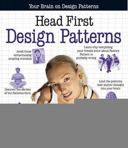 I think the Head First series really gets it when it comes to how the
mind works and learns. From the introduction to Head First Design
Patterns.
I think the Head First series really gets it when it comes to how the
mind works and learns. From the introduction to Head First Design
Patterns.
Your brain craves novelty. It’s always searching, scanning, waiting for something unusual. It was built that way, and it helps you stay alive.
Today, you’re less likely to be a tiger snack. But your brain’s still looking. You just never know.
So what does your brain do with all the routine, ordinary, normal things you encounter? Everything it can to stop them from interfering with the brain’s real job—recording things that matter. It doesn’t bother saving the boring things; they never make it past the “this is obviously not important” filter.
In a subsequent section, the book describes the Head First learning principles, a couple of which I quote below. I highly recommend reading this entire intro the next time you are in the bookstore.
Make it visual. Images are far more memorable than words alone, and make learning much more effective (up to 89% improvement in recall and transfer studies). It also makes things more understandable. Put the words within or near the graphics they relate to, rather than on the bottom or on another page, and learners will be up to twice as likely to solve problems related to the content.
Use a conversational and personalized style. In recent studies, students performed up to 40% better on post-learning tests if the content spoke directly to the reader, using a first-person conversational style rather than taking a formal tone.
…
What we see here is that studies after studies show that appropriate use of images and graphics improve recall. Not only that, but a casual tone, like that found in a blog, also helps recall.
Unfortunately, Petzold draws an unfair analogy between Adam Nathan’s WPF book and PowerPoint. We’ve all heard that PowerPoint is evil, but the evil is in how users misuse PowerPoint, not PowerPoint itself. PowerPoint certainly makes it easy to go to the extreme with noisy graphics resulting in garish crowded presentations.
It’s this proliferation of PowerPoint presentations that favor graphics to the detriment of the content that leads to the disdain towards PowerPoint. But it is also possible to create sublime presentations with PowerPoint with just the right amount of graphics.
Even Tufte would acknowledge that getting rid of graphics and bullet points completely is also extreme in the opposite direction and works against the real goal, to convey information in a manner that the audience can understand and retain it.
Drawing a comparison between Nathan’s book and PowerPoint suggests that the Nathan’s Book is all fluff and flash. But based on reading sample chapters, that is hardly the case. As Jeff wrote, the graphics, colors, and bullets all are used judiciously and appropriately. This isn’t the case of Las Vegas trying to pretend it is Florence. There’s real substance here.
Comments
11 responses